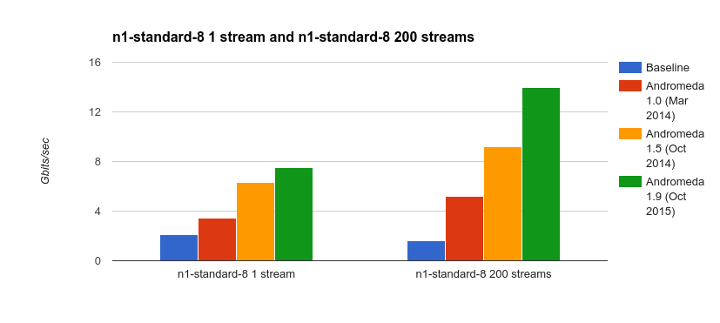
|
How to Make iOS 9 Easier to Read in Just 7 TapsWhen Apple introduced the sparse, clean iOS 7 design that lives on in iOS 9, thousands blogged out in dismay. “It’s too lightweight! The fonts are too spindly! The background is too bright! There aren’t rectangles around buttons—we don’t know what’s a button and what’s not! The Control Center is transparent—we can’t read it! You moved our cheese—we... Read More
|